The emblems of major DIY brands have continuously evolved over the decades, reflecting both market trends and the values of the companies. These symbols, often etched in the collective unconscious, are much more than mere logos: they embody promises of quality, trust, and innovation.
The evolution of these emblems generally follows societal transformations and technological advancements. From stylized tools to more abstract representations, each change marks a new step in the relationship between brands and their customers. It is a visual dialogue that speaks volumes about the priorities and ambitions of these DIY giants.
Symbolism of the Emblems of Major DIY Brands
DIY brands use their logos as powerful communication tools. Take the case of the Leroy Merlin logo. Founded by Adolphe Leroy and Rose Merlin, this brand has established itself as a leader in France. Its triangular logo, reminiscent of a house roof, symbolizes both stability and innovation. Acquired by the Mulliez family and integrated into the Adeo Group, Leroy Merlin has managed to adapt its visual identity to stay in tune with consumer expectations.
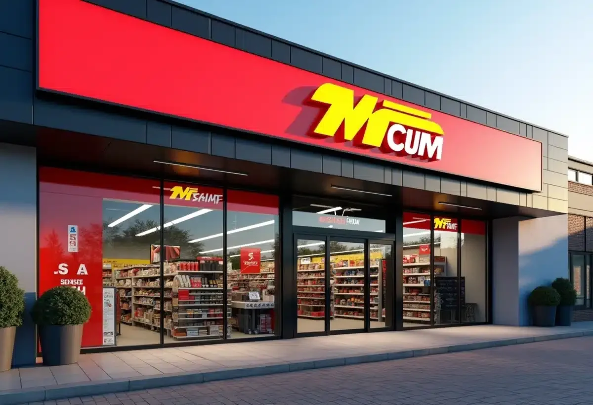
L’Entrepôt du Bricolage, belonging to the SAMSE group, opted for a more industrial symbolism. Its logo conveys an image of robustness and functionality, in line with its promise to provide professional quality products. This graphic choice reflects the company’s philosophy: to offer solid and durable solutions to its customers.
Brico Pro, a member of the Cofaq Group, has also focused on a strong visual identity. Its logo incorporates elements that evoke both tradition and modernity, a balance that allows it to reach a wide clientele. The combination of colors and shapes in its emblem conveys an image of trust and expertise.
These examples show how DIY brands use their logos to build a trusting relationship with their customers. The design, colors, and shapes chosen are not trivial: they reflect the values and mission of each company.
Evolution of DIY Brand Logos
The evolution of DIY brand logos reflects strategic and aesthetic changes. Take Leroy Merlin, whose logo has evolved to meet new market expectations. Initially simple and functional, it has gradually integrated more modern and dynamic elements to match the image of an innovative and forward-looking company. The green triangle, a symbol of growth and optimism, has remained constant, thus affirming the continuity and stability of the brand.
Brands are not hesitant to modernize their logos to remain competitive.
- L’Entrepôt du Bricolage, belonging to the SAMSE group, recently revisited its visual identity. The new logo combines clean lines and bright colors, reflecting both the solidity and accessibility of its products. This modernization expresses a desire to connect with a younger and more connected clientele.
- Brico Pro, under the aegis of the Cofaq Group, has also evolved its logo to better meet market demands. The current design, with its sharp lines and contrasting colors, illustrates a commitment to professionalism and trust. This transformation aims to consolidate Brico Pro’s position as a key reference in the DIY field.
These graphic evolutions are not trivial. They reflect repositioning strategies and alignment with current market trends. DIY brands invest in their visual identities to offer a coherent and attractive image, in line with their customers’ expectations.